I'm not sure why I decided to do this, but ever since I transferred to Epp's class, I decided I wanted to use a wordpress blog. I've had the same blog since BDS and I'm thinking it's time for an upgrade.
From now on, my posts can be found at jenbeckdesign
Wednesday, February 26, 2014

Wednesday, February 19, 2014
Understanding Why
All it takes is a short conversation with a fellow graphic designer about typography to realize that we're all nerds here. We have our favorites. Sure. It's easy to pick a side... sans serif vs. serif, or even get reeeal specific... Gotham, Meta, Sabon (to list a few of mine.) The majority of the the time, however, the perfectly placed typeface has nothing to do with "I liked it," or "it just looked good," and everything to do with history, context and appropriateness.
Reading Jessica Helfand's Type Means Never Having To Say You're Sorry made me delve into the reasoning behind my recent typeface choices. While I've never been a constant user of Futura … (nor even a fan, sorry) ((nor ever had a project that required a Bauhaus inspired font)) … it is apparent how trends can influence design without the designer even realizing.
Helvetica, is a perfect example. It's everywhere. There are even documentaries about the typeface. I'm fairly certain that Andrea has banned the use of it in class. Why? Because we, as designers, most likely can't explain why we chose it. Except for maybe Claire. She knows A LOT about type.
It is important to expand your Font Book, and even step away from your favorites. It's even more important to know a little bit of history behind typography so that when it comes to choosing a font for a project, it's one that fits. This article helped me understand that research, even on a typographic level, is paramount. It can be very fulfilling explaining the reasoning to a professor behind a typeface choice. It's like you are rewarded super nerd points, and it's not even brown-nosing. It's pride.
If I had to choose a close alternative to Futura, it'd have to be Akzidenz Grotesk. They seem to be fairly proportionate in shape and width and also shares some similar features. I find this to be extremely interesting, because Akzidenz Grotesk most likely, with the combination of Paul Rand's education in Germany, inspired the creation of Futura. AG was developed decades before Futura...
Designing Under the Influence by Michael Bierut only solidified the points from Helfand's article. As designers, we absorb the visual world around us. At times, it's difficult to realize where our inspiration is rooted. This is no excuse when choosing a typeface. While it's impossible to know about ever influential designer, or why certain fonts are trending...it is important to know why a font is chosen for a project or the reason the typeface seems to fit.
The most eye opening aspect of the article was the fact it came from the perspective of an interviewer...meaning that one day, I'm going to have to sit in front of a potential employer and explain why I chose Gill Sans as my sans serif typeface for my Understanding Grammar project.
You can ask me. I know why.
Wednesday, February 12, 2014
Thinking Form
André Grürtler
A Swiss typographer, editorial collaborator, and teacher. Most known for his authority on type and type design. For 20 years, he was the editorial collaborator for Typografische Monatsblätter, where he designed numerous typefaces including Unica, as part of ‘Team 77’.
I was drawn the abstracted nature of his typography and how you had to look closely to decipher the letterforms and words. Some seemed to build as your eyes move up or down the page, transforming into something concrete. It was also refreshing to see work in predominantly black and white. Color is a beautiful aspect of design, but there is something to be said for sticking to the basics.


Horst Hohl
I had a difficult time finding information on Horst Hohl. From what I know, he was a Swiss typographer and teacher who studied at the Schule für Gestaltung Basel.
Layers, Layres, Layers!
This reminded me of doing pressure prints in my letterpress class, which made this body of work catch my eye. Seeing them in a series, identifying the numbers as the counted upwards, and recognizing the letterforms became something I searched for once I realized the pattern. At times, the numbers overlapping the letters would form a unique shape or even an additional beginnings of a letter. I enjoyed looking to find a harmonious combination in such an abstract composition.


Gregory Vines
Is an American graphic designer from Springfield, Massachusetts who teaches in the VisCom Institute, HGK/FHNW in Time Based Media and Imagery. He received his BFA at the Massachusetts School of Art in 1968. In the early 70s, he studied in the advanced class for graphic design at Schule für Gestaltung Basel, and then began teaching in 1978.
Can I print these as posters and put them in my room? No, seriously.
Also, check out his website. http://www.gpvd.ch/why.html
You can uncover information as you click on it, but it's been abstracted so much that you aren't entirely sure where you are going.
I must be in a black and white mood, because this is the third designer that I've been drawn to that predominantly produces prints lacking color. Vines's work is unlike the previous designers, because it feels more like typography is integrated into imagery and something greater and more complex, rather than containing only typography. His work feels like you are jumping into a different world entirely. One made from the imagination, but also stems from reality. Altering perception forces you to really absorb the information on the page, and when you do, you notice typography is subtly sprinkled in each composition.


Burton's work, since it relates so closely with science, feel undeniably organic. There is a flow and a direction to each of his designs and a vast understanding of color, patterns, and space. Some of his work falls on the side of bizarre, but most feel like them derive from something natural and familiar. It's interesting that he's also able to create patterns out of concrete items. His piece with the different kinds of eggs really caught my eye. The pattern formed by the different eggs, as well as the patterns on each shell, combine to make something unique out of something that is naturally, very normal.


A Swiss typographer, editorial collaborator, and teacher. Most known for his authority on type and type design. For 20 years, he was the editorial collaborator for Typografische Monatsblätter, where he designed numerous typefaces including Unica, as part of ‘Team 77’.
I was drawn the abstracted nature of his typography and how you had to look closely to decipher the letterforms and words. Some seemed to build as your eyes move up or down the page, transforming into something concrete. It was also refreshing to see work in predominantly black and white. Color is a beautiful aspect of design, but there is something to be said for sticking to the basics.
Horst Hohl
I had a difficult time finding information on Horst Hohl. From what I know, he was a Swiss typographer and teacher who studied at the Schule für Gestaltung Basel.
Layers, Layres, Layers!
This reminded me of doing pressure prints in my letterpress class, which made this body of work catch my eye. Seeing them in a series, identifying the numbers as the counted upwards, and recognizing the letterforms became something I searched for once I realized the pattern. At times, the numbers overlapping the letters would form a unique shape or even an additional beginnings of a letter. I enjoyed looking to find a harmonious combination in such an abstract composition.
Gregory Vines
Is an American graphic designer from Springfield, Massachusetts who teaches in the VisCom Institute, HGK/FHNW in Time Based Media and Imagery. He received his BFA at the Massachusetts School of Art in 1968. In the early 70s, he studied in the advanced class for graphic design at Schule für Gestaltung Basel, and then began teaching in 1978.
Can I print these as posters and put them in my room? No, seriously.
Also, check out his website. http://www.gpvd.ch/why.html
You can uncover information as you click on it, but it's been abstracted so much that you aren't entirely sure where you are going.
I must be in a black and white mood, because this is the third designer that I've been drawn to that predominantly produces prints lacking color. Vines's work is unlike the previous designers, because it feels more like typography is integrated into imagery and something greater and more complex, rather than containing only typography. His work feels like you are jumping into a different world entirely. One made from the imagination, but also stems from reality. Altering perception forces you to really absorb the information on the page, and when you do, you notice typography is subtly sprinkled in each composition.
Roman Cieślewicz
A Polish graphic designer and photographer that attended the School of Artistic Industry, and went on to work for Vogue, Elle, and Mafia. He also taught at l'Ecole Superieure d'Arts Graphiques (ESAG) in Paris.
Here's some color. And some weirdness, but it's a weirdness that I'm intrigued by. All the colors he uses are so vibrant, that you can't help but gravitate toward it. In many of his posers, the dark spaces feel like a respite from the rest of the composition. The typography is simple and sparing, which with the strangeness of his work, feels appropriate for the balance of the composition.
Bruno Monguzzi
A Swiss graphic designer that attended school at Ecole des Arts Decoratifs in Geneva. He also studied gestault psychology, photography, and typography at Saint Martin's School of Art and the London College of Printing. After working in London, Monguzzi moved to Milan to join the Studio Boggeri – at the time the leading design and advertising agency in Italy. Later, he joined the Charles Gagnon and James Volkus office in Montreal, to help design nine pavilions for Expo 67.
His work is very geometric and clean, and each piece has a simple, almost primary color palette of a few colors with black and white. Even though there is a lot going on in most of his posters, they still find space to breathe. He does a stunning job with finding and creating white space, even where there is a lot of content on the page.

Will Burton
A German designer from Cologne is known for interrelating science with design. He's worked for Fortune Magazine, taught at the Pratt Institute and Parsons School of Design, and created exhibits for IBM, Eastman Kodak, the Smithsonian, Mead Paper, Union Carbide, Herman Miller Furniture, and the United States Information Agency.
"The creative person who can find himself or herself in this expanding universe is not only fortunate but indispensible."
Burton's work, since it relates so closely with science, feel undeniably organic. There is a flow and a direction to each of his designs and a vast understanding of color, patterns, and space. Some of his work falls on the side of bizarre, but most feel like them derive from something natural and familiar. It's interesting that he's also able to create patterns out of concrete items. His piece with the different kinds of eggs really caught my eye. The pattern formed by the different eggs, as well as the patterns on each shell, combine to make something unique out of something that is naturally, very normal.
Tuesday, February 11, 2014
The Things I Find on the Internet
I can't say that I like this song, but I came across this music video and was surprised by its use of type.
https://www.youtube.com/watch?v=N0Brmnl29uU
After Effects is not a program that I know...at all, but seeing music videos like this make me want to experiment. Watching my group leader, Josie, work with the program during the 48 Hour RePack also gave me an idea of what can be done with After Effects. I was fully impressed by what she could accomplish in such a short amount of time.
It's exciting to think that in a year, I could be exceedingly proficient at the major graphic design programs.
https://www.youtube.com/watch?v=N0Brmnl29uU
After Effects is not a program that I know...at all, but seeing music videos like this make me want to experiment. Watching my group leader, Josie, work with the program during the 48 Hour RePack also gave me an idea of what can be done with After Effects. I was fully impressed by what she could accomplish in such a short amount of time.
It's exciting to think that in a year, I could be exceedingly proficient at the major graphic design programs.
Wednesday, February 5, 2014
Listen — Bruce Mau
Bruce Mau, a Canadian designer, provides a 43 step program, the Incomplete Manifesto for Growth, intended for designers and creative types to help them think about their design process. His design firm, Bruce Mau Design, is known for its high standards for design, its process, and its purpose:
We believe in the power of design to affect change and are committed to producing nothing less than world-class design. Our work is recognized for its depth of thought, clarity of purpose, boldness of vision and impact.
At the end of the day, we all want our designs to mean something. Design isn't always about creating beautiful things. His ideology suggests it should help make the world a better place.
I related to his article for multiple reasons. Ever since I decided to return to school for design, my main focus and energy has been on allowing myself to grow as a person and a designer. There are opportunities all around us to learn something new, improve upon aspects of our lives, and find new ways to push ourselves. We were asked to choose a mantra from Mau's Manifesto, in which we try to accomplish in our lives for the week.
My choice seemed obvious.
We believe in the power of design to affect change and are committed to producing nothing less than world-class design. Our work is recognized for its depth of thought, clarity of purpose, boldness of vision and impact.
At the end of the day, we all want our designs to mean something. Design isn't always about creating beautiful things. His ideology suggests it should help make the world a better place.
I related to his article for multiple reasons. Ever since I decided to return to school for design, my main focus and energy has been on allowing myself to grow as a person and a designer. There are opportunities all around us to learn something new, improve upon aspects of our lives, and find new ways to push ourselves. We were asked to choose a mantra from Mau's Manifesto, in which we try to accomplish in our lives for the week.
My choice seemed obvious.
- Listen carefully.
Every collaborator who enters our orbit brings with him or her a world more strange and complex than any we could ever hope to imagine. By listening to the details and the subtlety of their needs, desires, or ambitions, we fold their world onto our own. Neither party will ever be the same. - I've been having a difficult time with listening lately. It requires a lot of focus, for me, and my life has me pretty preoccupied these days. With school and work, I barely have time to do the things that keep me sane. The times I do have with others, it seems like my mind is only where I feel like I need to be other than there: my studio. It's important to realize that not everything in the world revolves around me. That it's ok to take a break. That sometimes, by listening, you can actually be improving yourself. Who knows where inspiration can arise? Perhaps it's the next conversation I have.
I could have chosen a few mantras to live by from his Manifesto. It's important to take change one step at a time. Maybe I'll choose a new one next week....
Wednesday, January 29, 2014
Jessica Hische and Louise Fili
My heart is a little bit at ease after watching Jessica Hische speak. There is hope. Or at least, it feels like there is after hearing her story. As a design student, I think I'm safe in saying that we're all wondering how we're going to "make it" once we graduate. Jessica Hische is killing it, so how did she do it?
Practice.
Find an incredible mentor.
Do what you love.
It's incredibly refreshing to hear someone speak about their life and their work that is genuinely excited about it. She is a great speaker — easy to listen to, explains her work in a way anyone could understand, and is very much herself. She started by showing some of her work from school, which somewhat surprised me. In my mind, the things I create in school won't remotely compare to the work I imagine myself doing in my career. Jessica included her beginning to demonstrate the little things that can influence your future.
It surprised me that she didn't know she wanted her career to be in lettering. For some reason, I imaged that all typographers knew early on that they wanted to be typographers...because lettering is not easy. It takes hours and hours of practice, years of exposure, and an great understanding of type history and tradition.
This is why having a great mentor is important. Get that internship! Take that job! Do anything you can to get under the wing of someone you admire. Jessica landed a job with Louise Fili through self-promotion of her illustrations. She mentioned that she enjoyed doing lettering in college, but by no means was it as refined or beautiful as the work she began creating for Louise. This is what sparked it all. As a mentor, Louise provided a more traditional approach toward design, an unsaid desire to impress, and a very extensive library. This type of work relationship can change your life and become the catalyst to your career. Throughout the two and a half years that Jessica worked for Louise, she continued to do freelance and personal projects on the side.
Illustration and Design live in two completely different worlds. It's fun to watch how people make the both work together in their own career. For Jessica, it seems like she is hired for either one or the other, but it was pretty entertaining to hear her break down the differences between the two design areas.
The biggest gem I took from this talk was that you'll be rewarded for doing what you love. Stay passionate and keep creating, because sometimes, those personal projects can be the reason people know your name. Jessica gained a large part of her popularity from a personal project she started called Daily Drop Cap. If you love it, do it daily. It's bound to get you somewhere close to where you want to be.
Monday, December 9, 2013
David Carson
I had seen David Carson's Ted Talk on typography before. He is intrigued by the emotional response a viewer has to a story just simply by the typography that is used to present it.
How can two signs saying the same thing evoke a two different emotions or responses?
TYPOGRAPHY
A No Parking sign, for instance, can either come across as being a heard threat or something you disregard, just based on how the sign is made. It just goes to show that graphic design is everywhere. We use it as indicators for location, communication, self-expression, reinforcement, etc. All of this visual communication in the world is traveling toward a more minimalist approach, according to David Carson. He uses an example of a minimalist sign that had been vandalized by graffiti done in a minimalist style.
How can two signs saying the same thing evoke a two different emotions or responses?
TYPOGRAPHY
A No Parking sign, for instance, can either come across as being a heard threat or something you disregard, just based on how the sign is made. It just goes to show that graphic design is everywhere. We use it as indicators for location, communication, self-expression, reinforcement, etc. All of this visual communication in the world is traveling toward a more minimalist approach, according to David Carson. He uses an example of a minimalist sign that had been vandalized by graffiti done in a minimalist style.
Wednesday, November 13, 2013
Magazine Spread Logic
Why use more than one column on a page?
Multicolumn grids provide flexible formats for publications that have a complex hierarchy or that integrate text and illustrations. It increases the amount of flexibility for each spread as well as provide another element to add to hierarchy that integrates with images.
How many characters is optimal for a line length? words per line?
A line should be about 12 to 14 inches long. When working with a 9 pt to 12 pt font, it's reccommended to use ten to twelve words or sixty to seventy characters per line.
Why is the baseline grid used in design?
It's a great guide to base all the layout elements and serves as an anchor.
What are reasons to set type justified? ragged (unjustified)?
To create a clean shape on the page and be the most efficient with space, justify type. If awkward spacing has been created from justifying type, sometimes flushing left and jagged right can be a better solution. It creates more of an organic feel for the page.
What is a typographic river?
A typographic river occurs when the spaces between words in a body of text form and connect between lines to create a continuous white space that flows between lines. This is a no-no and should be adjusted, for it can be distracting for the reader.
What does clothesline, hangline or flow line mean?
This is an imaginary line positioned on a page where the designer designates to hang text from on that page.
What is type color/texture mean?
Type color can be influenced by the leading or space between lines of text. Smaller lines = bolder type color. Thicker lines = less type color. You can create texture and contrast in typography by alternating between bold and thin typefaces.
How does x-height effect type color?
Typefaces with high x-heights require more leading than those with smaller x-heights. So if you are looking for bolder color, use a typeface with smaller x-heights.
What are some ways to indicate a new paragraph. Are there any rules?
There are a variety of ways a designer can indicate a new paragraph. A few ways to start a new paragraph: indenting, extra space between lines of text, or the use of the paragraph symbol. The only rule I'm aware of for new paragraphs is that the first paragraph in a body of text should not be indented.
Multicolumn grids provide flexible formats for publications that have a complex hierarchy or that integrate text and illustrations. It increases the amount of flexibility for each spread as well as provide another element to add to hierarchy that integrates with images.
How many characters is optimal for a line length? words per line?
A line should be about 12 to 14 inches long. When working with a 9 pt to 12 pt font, it's reccommended to use ten to twelve words or sixty to seventy characters per line.
Why is the baseline grid used in design?
It's a great guide to base all the layout elements and serves as an anchor.
What are reasons to set type justified? ragged (unjustified)?
To create a clean shape on the page and be the most efficient with space, justify type. If awkward spacing has been created from justifying type, sometimes flushing left and jagged right can be a better solution. It creates more of an organic feel for the page.
What is a typographic river?
A typographic river occurs when the spaces between words in a body of text form and connect between lines to create a continuous white space that flows between lines. This is a no-no and should be adjusted, for it can be distracting for the reader.
What does clothesline, hangline or flow line mean?
This is an imaginary line positioned on a page where the designer designates to hang text from on that page.
What is type color/texture mean?
Type color can be influenced by the leading or space between lines of text. Smaller lines = bolder type color. Thicker lines = less type color. You can create texture and contrast in typography by alternating between bold and thin typefaces.
How does x-height effect type color?
Typefaces with high x-heights require more leading than those with smaller x-heights. So if you are looking for bolder color, use a typeface with smaller x-heights.
What are some ways to indicate a new paragraph. Are there any rules?
There are a variety of ways a designer can indicate a new paragraph. A few ways to start a new paragraph: indenting, extra space between lines of text, or the use of the paragraph symbol. The only rule I'm aware of for new paragraphs is that the first paragraph in a body of text should not be indented.
Tuesday, November 12, 2013
Ryan McGinley Uncovered


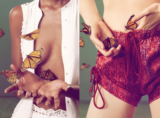


Word List to Describe Ryan McGinley's Photographs
Strange
Natural
Calming
Erotic
Provocative
Sensual
Naked
Raw - frank and realistic in the depiction of unpleasant facts or situations. strong and undisguised.
Colorful
Demanding
Nostalgic
Magical - beautiful or delightful in such a way as to seem removed from everyday life.
Fantastic
Mysterious
Subtle
Innocent
Personal - of or concerning one's private life, relationships, and emotions rather than matters connected with one's public or professional career.
Comfortable
Open
Beautiful
Saddening
Embarrassing
Meaningful
Striking - attracting attention by reason of being unusual, extreme, or prominent.
Elegant
Harmonious
Tense
Tender
Private
Impromptu
Staged
Nude
Connected
Familiar
Momentous
Realistic
Cultural
Progressive
Ridiculous
Loving
Carefree
Candid - truthful and straightforward; frank. (of a photograph of a person) taken informally, esp. without the subject's knowledge.
Unfolding
Documentary
Experimental
Exciting
Shocking
Crude
Spontaneous
Emotional - arousing or characterized by intense feeling.
Telling
Alive
Emotionally Raw
Strikingly Candid
Magically Emotional
Striking and Raw
Candid Personality
Rawly Emotional
Ryan McGinley in Conversation with Gerald Matt and Synne Genzmer, September, 2007, Kunsthalle Wien, Verlag der Buchhandlung Walther König, Köln
In your photography you take up Nan Goldin’s idea of a visual diary, making portraits of your friends and your own generation. How do you feel about being seen as a successor to her? Or do you rather try to distinguish yourself from her?
Ryan McGinley: When I started making photos in the late nineties I was very influenced by Nan. I remember looking at her book The Ballad of Sexual Dependency in 1997 and thinking, who are these people? Where are those places and where can I sign up? The world she created through her photographs mesmerized me and inspired me to make photographs of my own friends. After I was photographing intensely for about a year or so, I realized that I was actually creating my own world.
I was a fly on the wall shooting what was going on in my life, which was spontaneous and exciting. We were all on drugs, having sex, writing graffiti, hanging out at parties and having a great time. It was all so fun and I was having fun documenting it. I would never not have my camera and I was never not working. All of my subjects were willing collaborators and they were excited about being photographed. They were all artists in their own right and understood what I was trying to do. I wasn’t trying to imitate Nan. When you live in downtown Manhattan each generation of kids that are involved in that culture seem to be all doing the same thing. After about two years I couldn’t wait for things to happen any longer. I took a new direction in my work and started setting up situations to be photographed. They still were in the same vein as my older work – 35mm, grainy, spontaneous shots. The only difference was that they were more thought out. I would choose locations and people and had more of an idea for what I wanted to accomplish with the photographs I was making. It was a departure from documentary photography, and I guess that’s when I started to distinguish myself from photographers like Nan Goldin. I suppose I started to develop my own style and find my own voice.
Over
a period of three years you photographed close to 100 Morrissey concerts. Your
images are mainly of groups of people, the audience and individuals involved in
the event. The image of the mass and of the individual results in a mood
portrait of the musical event, recording ecstatic moments, feelings of
belonging and collective emotions. What is interesting for the photographic eye
in such relationships of tension?
RM: I started shooting the Morrissey concerts
because I’ve been a fan of his music from a very young age. His lyrics spoke to
me; they were so close to the things happening in my life. When I started
taking pictures I would go to the shows and sneak rolls of film in my socks and
hide my camera in my underwear. I’d be in the crowd shooting Morrissey and my
friends that I attended the concert with. When I started getting the photos
back over time I decided it had to become a project. The concerts tied into
what I was trying to accomplish in my nude work. People losing themselves in
the moment, acting out, bathed in light. It was about a subculture that I felt
an affinity with. I put a book together of the photos I had made so far and
brought it over to Morrisey’s record label. Strangely enough, Morrissey’s
manager was also the manager of Elton John who, from the beginning, had always
been a collector of my work. I got granted permission from his manager and the
man himself to shoot wherever I wanted throughout the concert. Shooting the
shows required a different approach than my other work: I had limited time to
make the photographs and was shooting people that I didn’t know. I would always
start out between the barricade and the stage for the first three songs and
make photos of fans that go to every show and follow him around the world. The
beyond-dedicated fans. The fans that wait 24 hours in the freezing cold to secure
their spot up front. When I’m shooting, I’m looking for the person that is
really getting off. The fan that is either in hysterics, screaming the lyrics
at the top of their lungs, or hypnotized by Morrissey on stage.
I’m always trying to preoccupy people and
distract them so they are unaware of the camera. The concerts were perfect for
that reason. The loud music is disorienting. Everyone is fixated on Morrissey.
I had the freedom to investigate people without them being aware of my
presence. After shooting up front, I would either shoot the sea of people from
above or navigate my way back into the heart of the audience where the most
action was happening. Fans jumping around, being pushed and pulled, drinks
flying in the air. This was the spot that was by far my favourite place to make
photographs. It was always so difficult shooting under these circumstances but
that’s what was so appealing to me. Reloading my camera in the most difficult
situation possible was a challenge. I had to be like a hunter in the crowd to
seek out fans who were losing their heads in the moment. The ones transfixed
and the ones in action. The stage lighting played a part in that series. After
attending so many shows I knew how the songs would dictate the light and when
the bright lights would bathe the fans in every color of the rainbow. In the
early stages of the project I would be constantly dropping my camera jumping
around in the audience. The back would pop open often and the film would get
exposed. I was very interested in the result of this and decided to start
experimenting with my film before the concerts. I would expose to all different
kinds of lights. Sunrises, sunsets, TV’s, house lighting, colored bulbs, etc. I
began a journal about what would happen to the film after each exposure. I
would then re-shoot the exposed roll at the concerts and mixed with the stage
lighting it would give me a new and exciting color palette. That’s why the
colors are so rich and saturated or very muted and pastel. I shot close to 100
concerts all over the world. The greatest part of any project was that I got to
listen to Morrissey, my hero, when I was taking the pictures.
Your photographs sometimes show the subject either forgetting
themselves in a particular moment or looking self-consciously into the camera.
To be photographed has become so much a part of everyday life that it is either
not noticed or is taken for granted, an oscillation between self-forgetfulness
and self-presentation. Do you look for these particular moments? Do you also
stage them?
RM: I don’t stage my photographs but at the same time they are not
documentaries. I make these moments happen by putting certain people in certain
situations. My subjects are usually friends or someone that I might have met at
a club or walking down the street. I seek out interesting people that I know
will perform for my camera, people with dynamic personalities, in much the same
way that a director finds an actor they like to work with. I like to think of
my photographs as happenings. Like the happenings of the 1960′s and 1970′s. I
find a beautiful location that functions as a backdrop. I use inspirational
photographs to figure out what direction I want the shoot to go in. They range
anywhere from amateur photos from the internet, screen-grabs from movies and TV
shows to naturist documentaries, photographs from vintage pornography, nudist
publications, camera periodicals, and artists I’m inspired by. We start off by
looking at a lot of imagery and ideas and then narrow them down to a few that feel
right and work that day. Then I let them run free and direct them with a very
loose hand. If I want something to happen I’ll make it happen or if something I
didn’t expect happens and I liek it I’ll go with it. It’s usually a waiting
game. You can only direct someone so much before their personality takes over
and they offer me something I never would have expected. I shoot a lot of
photos and when editing find that one image that is perfect from that one
shoot. If I make a successful image it will get across my idea, the gestures of
the subject will be casual, the light will be perfect, the composition will
work, and the feeling will be real. I like to be surprised when I get back my
film. That’s the exciting part of making photographs; you never have full
control and you never know what might happen. Each roll of film is like a
little gift under the Christmas tree.
You had your artistic breakthrough with
pictures of urban youth culture, documentary images of a sub-culture, the world
of the skateboard, graffiti and music. A few years ago you shifted your
settings to the natural world outside New York. Has the treasury of urban
motifs exhausted itself?
RM:
When I first move to New York I never wanted to leave. I think I might have
left the city once over a period of seven years. All I wanted to do was stay
out late and roam the streets of New York. Ride my bike around and end up
anywhere. Being a young teenager coming into the city from the suburbs also had
a big impact. Skateboarding around the city was inspiring. I was exposed to all
different kinds of worlds. Being uptown observing the businessmen and cruising
downtown to the vagrants underneath the Brooklyn Bridge. Hanging out with kids
of all races and economic backgrounds. Utilizing the urban landscape to have
fun and do tricks. I guess the way I got into making photographs was making
skateboard videos in high school. I realized I was more interested in the
in-between moments that happened and people’s characters on the videos rather
than the skating itself. Looking back, I see that making those skateboard
videos is very similar to the way I work now. Back then it was all about the
trick and doing it over and over again until you landed it. In my photo-shoots
nowadays I might have someone do the same action numerous times. Running back
and forth, jumping around, falling until the person can’t do it anymore. I like
to push my subjects as far as they can go. I often find the best results happen
when someone is so physically drained they are in a state of exhaustive bliss.
I loved photography graffiti writers because I identified with their insanity.
These crazy kids that wrote their name tens of thousands of times all over the
city. Hanging off rooftops 15 stories up to make their art. I felt the same
making photos all day and night everyday and night. I was so fascinated by that
lifestyle. I was always up for an adventure and never afraid to get in trouble.
All of these subcultures tie into one another. Skating, graffiti, music; there
are so many crossovers. Music has always been a large part of my life, defining
the way I dressed, my attitude, my beliefs. All of these elements play a large
roll in my photographs.
Subscribe to:
Posts (Atom)