On the double-page spreads, you have the vertical red stripe down the right side of the first spread, which works well. It is nice that it is repeated on the second spread, but the top bar of color seems like too much and distracts from the images. On the second spread, you could try moving the chairs down a little --closer to the bottom of the page--and give your layout a little more breathing room. I still think the bottom Table of Contents and Title page have the most potential, but you will probably come up with better layouts as you refine these. Lots to do on Thursday, so the critique will be rushed. You can always email files or keep posting on the blog.


On the double-page spreads, you have the vertical red stripe down the right side of the first spread, which works well. It is nice that it is repeated on the second spread, but the top bar of color seems like too much and distracts from the images. On the second spread, you could try moving the chairs down a little --closer to the bottom of the page--and give your layout a little more breathing room.
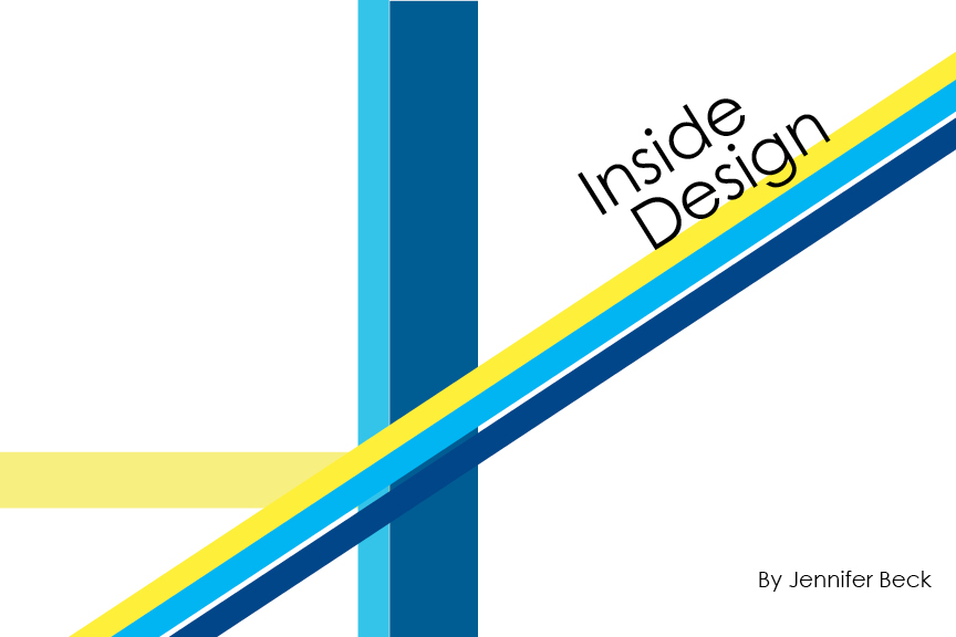
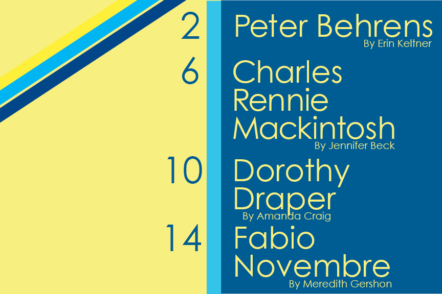
ReplyDeleteI still think the bottom Table of Contents and Title page have the most potential, but you will probably come up with better layouts as you refine these.
Lots to do on Thursday, so the critique will be rushed. You can always email files or keep posting on the blog.